
In the bustling world of data visualization, heat map examples have emerged as an indispensable tool, providing a colorful palette of insights across various sectors. These multi-hued representations hold the power to instantly communicate complex patterns and variations, making them invaluable in today’s data-driven age. But what exactly is a heat map? How have they evolved? From tracing the intricate oscillations of the stock market, aiding financial analysts in their predictions, plotting property hotspots for potential homebuyers, or even analyzing an athlete’s performance on the playing field—heat maps are reshaping how we interpret and respond to information. Dive in as we journey through heat map applications, unraveling their significance in realms you might never have imagined.
What Is a Heat Map?
What is a heat map, you ask? It’s more than just a colorful representation. It’s the crystallization of data, whether we’re discussing heat map stocks, the broader market heat map, or stocks heat map. The emphasis on such tools underlines our civilization’s drive to streamline and visualize vast datasets, from the nuances of heat map real estate to the intricacies of stock heatmap utilities. As we gaze into the future of data visualization, it’s evident that the evolution of heatmaps will continue, driven by technology and our ever-growing thirst for clarity and understanding. Whether it’s through sophisticated applications in finance or the expansive domain of real estate, heat maps are more than just visual aids. They’re the prisms through which we decode our data-rich world.
Some Attributes of Heat Maps
Here are some attributes and applications of heat maps:
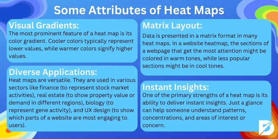
- Visual Gradients: The most prominent feature of a heat map is its color gradient. Usually ranging from cool to warm colors (like blue to red), this gradient denotes the data’s relative values. Cooler colors typically represent lower values, while warmer colors signify higher values.
- Matrix Layout: Data is presented in a matrix format in many heat maps. For instance, in a website heatmap, the sections of a webpage that get the most attention or clicks might be colored in warm tones, while less popular sections might be in cool tones. You can get details about website heatmap from our “What Is Google Analytics Heatmap” article.
- Diverse Applications: Heat maps are versatile. They are used in various sectors like finance (to represent stock market activities), real estate (to show property value or demand in different regions), biology (to represent gene activity), and UX design (to show which parts of a website are most engaging to users).
- Instant Insights: One of the primary strengths of a heat map is its ability to deliver instant insights. Just a glance can help someone understand patterns, concentrations, and areas of interest or concern.
Heat Map Examples
Here are the heat map examples.

Stock Market Heat Mapping
The evolution of the stock heat map is a testament to humanity’s ever-growing need to simplify and visualize complex information. Over the years, as both technology and data have advanced, adapting and diversifying to cater to many applications.
Early Beginnings:
The rudimentary concept of using colors to represent varying data points dates back centuries. Early cartographers and geographers, for instance, would use color gradients to depict differences in geographical and topographical elements like altitude or population density.
Modern Statistical Application
The term “heatmap” in its modern sense began to gain traction in the mid-to-late 20th century, especially with the advent of computational biology. Then, in the 1990s, heat maps became particularly significant in molecular biology, where they were used to visualize gene expression data.
Technological Advancements
The dawn of the digital age ushered in a new era for heat maps. Computer software enabled more intricate designs, greater data processing, and the ability to handle vast datasets. Tools like Tableau, Google Analytics, and also Crazy Egg emerged, providing diverse heatmap solutions for different industries.
Diverse Domains
With technology making heat mapping more accessible, its application started branching out. The applications became manifold, from finance, where it visualized stock market movements, to website design, illustrating user engagement.
Real-time and Interactive Heat Maps
As the internet became ubiquitous and technology advanced, we saw the rise of real-time and interactive heat maps. Data could be updated in real-time, and viewers could interact with the heat maps, drilling down for more detailed information or adjusting parameters to see different views.
Integration with Augmented Reality (AR) and Virtual Reality (VR)
With AR and VR technologies becoming mainstream, there’s potential for heatmaps to be superimposed on real-world environments. For instance, athletes wearing AR glasses could see heat maps overlaid on their training grounds. It provides real-time feedback on their performance.
Machine Learning and Predictive Heat Maps
With their ability to analyze and predict patterns, machine learning algorithms can now be combined with heat maps. This union allows for predictive heat mapping, where potential future patterns and hotspots can be visualized based on historical data.
The journey of heat maps from simple color-coded maps to complex real-time, interactive visual tools is emblematic of our society’s progress in data visualization. As we continue to produce more data and seek more efficient ways to interpret it, heat maps will undoubtedly evolve, playing a pivotal role in our understanding of the world.
Financial Services Industry Using Heatmaps
The financial services industry is a complex ecosystem of markets, institutions, and professionals that operate in an environment where split-second decisions can mean the difference between profit and loss. As the industry becomes more data-driven, heat maps have become invaluable for visualizing large financial data sets to identify trends, patterns, and anomalies. Here’s how the financial services industry harnesses the power of heat maps:
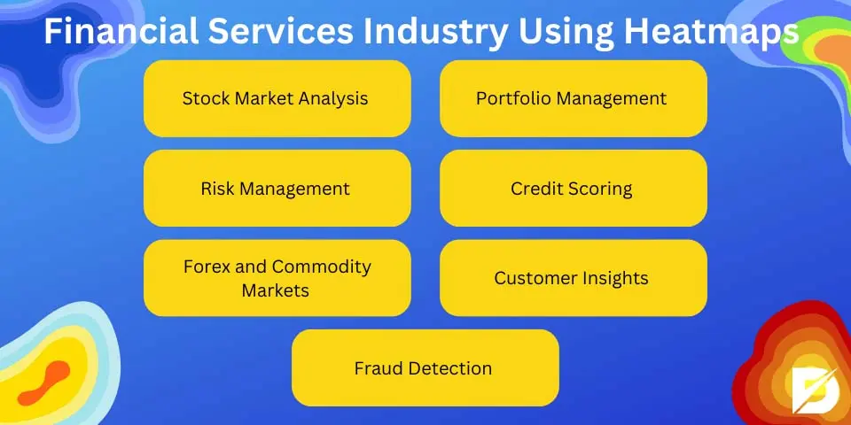
Stock Market Analysis
Heat maps are commonly used to provide a visual overview of stock market activity. Stocks performing well might be highlighted in green, while those underperforming could be shown in red. This color-coded system lets investors and traders quickly identify hot or cold stocks or sectors.
Portfolio Management
For investment managers, a heat map can visualize the performance of various assets within a portfolio. It can highlight which assets deliver the best returns and which are lagging, helping in the decision-making process for reallocating assets.
Risk Management
Financial institutions use heat maps to represent risk across different departments, assets, or investment strategies. Different colors can indicate varying levels of risk, enabling risk managers to quickly identify and address potential areas of concern.
Credit Scoring
Banks and credit institutions can use heat maps to visualize data related to credit scores in different regions or demographics. This helps in assessing the creditworthiness of individuals in various categories or locations.
Forex and Commodity Markets
In foreign exchange and commodities, heat maps provide a quick overview of currency pair movements or the fluctuation of commodities like gold, oil, or agricultural products.
Customer Insights
Heat maps can be employed to understand customer behaviors, like which financial products are popular in specific demographics or regions. This can guide financial institutions in tailoring their offerings to meet the specific needs of their clientele.
Fraud Detection
By visualizing transaction patterns, heat maps can assist financial institutions in detecting fraudulent activities. Anomalies or unusual patterns can be quickly spotted, prompting further investigation.
Real Estate Heat Map
A real estate heat map is a graphical representation that uses color gradients to showcase data distribution across different geographical regions. For example, areas with high property values might be shown in warm colors like red or orange, while areas with lower property values might be depicted in cooler colors like blue or green.
Applications in Real Estate
- Property Prices: One of the most common uses of heat maps in real estate is to represent property prices in different areas. At a glance, potential buyers or investors can determine the hotspots of high value and areas where properties might be more affordable.
- Rental Yields: For investors interested in rental properties, a heat map can show regions with the highest rental returns, helping guide investment decisions.
- Demand and Supply: Heat maps can visualize areas with high demand (where many buyers are looking) versus areas with an oversupply of properties. This can be invaluable for developers or investors who gauge the market before purchasing or developing.
- Crime Rates: Safety is a primary concern for many property buyers. Heat maps can depict areas with high or low crime rates, guiding individuals in making informed decisions about where to purchase property.
- Amenities and Infrastructure: Want to know which neighborhoods are close to schools, parks, or public transit? Heat maps can display the distribution of various amenities, making it easier for buyers to find areas that cater to their specific needs.
- Demographics: For those interested in the demographic breakdown—age groups, income levels, or any other parameter—a heat map can visually represent such data across different neighborhoods.
- Future Development Plans: If a city has future development plans, such as new transit routes or commercial hubs, heat maps can help potential investors visualize where future growth might occur.
- Environmental Factors: Factors like flood zones, noise levels, or proximity to industrial areas can also be visualized using heat maps, ensuring buyers know of any potential environmental concerns related to a property.
Conclusion
In the intricate arena of data interpretation, heat maps have carved a significant niche, becoming a foundational pillar in our comprehension of complex patterns. Their vibrant, intuitive designs make them an irreplaceable instrument, particularly when one reviews heat map examples from diverse fields. The financial landscape, dominated by instruments such as the stock market heat map, has witnessed a transformative change in its analytical approach.
Frequently Asked Questions About
Heat maps typically use a gradient from cool to warm, like blue to red. Blue often represents lower values, while red indicates higher values. The chosen palette should resonate with the data’s context.
Website heat maps visualize user behavior, such as clicks, scrolls, or cursor movements. They offer insights into user engagement and website usability. Digital marketers and web designers find them especially valuable.
Real estate heat maps visually represent property values across areas. They highlight high-value hotspots and more affordable regions. This visual tool aids buyers, sellers, and agents in decision-making.
Traditional heat maps show current or historical data. However, heat maps can forecast future trends with machine learning and predictive analytics. This fusion of tech and visualization is becoming more prevalent.
Geographical maps show physical landmarks; contour maps connect points of equal value. Heat maps use color gradients to display varying data values. Each serves unique visualization purposes.
")


No comments to show.