
What Does Mobile Friendly Website Mean?
A mobile compatible website means that your website can be viewed smoothly on mobile devices with different screen sizes. Websites are optimized and sized primarily for desktop devices.
Mobile devices such as tablets and smartphones have smaller screen sizes. Moreover, there are mobile devices with screens of many different sizes. If your website is mobile compatible, the visual, video and text content on your page will adapt to the screen size of the mobile device.
A user who logs in to your website from a mobile device can see all the content on the page if you have a mobile-compatible website. He/she can easily navigate your web page and reach the desired buttons.
Mobile compatibility includes many elements such as font, text size, paragraph length, location and size of keys. With mobile friendly testing tool, you can see whether your website is optimized for mobile devices.
What Is Mobile Friendly Test?
A mobile-friendliness testing tool is a tool that examines whether your website is optimized for mobile devices. It gives you information about good practices for mobile devices on your website and practices that harm the mobile experience.
Dopinger mobile usability test directs you to the website analysis page as soon as you enter your website's URL. Here, detailed analysis of your website is made under many topics such as on-site SEO, off-site SEO, social media. In this section, there is a separate section for mobile compatibility. In other words, you can both make a general analysis of your website and perform Google mobile friendly test.
In the mobile compatibility section, the instant view of your website on tablets and smartphones is shown. Additionally, mobile page speed is evaluated out of 100 points. Apart from this, evaluations are made on various metrics related to mobile SEO. At the end of the section, it is stated whether your website is mobile compatible or not. At the top, next to the "Mobile Compatibility" heading, the mobile evaluation is expressed with a word and this phrase is written in different colors depending on the success.
What Metrics Will You Be Able To Test with Dopinger's Mobile Friendly Test?
Dopinger allows you to use the mobile version of your website in a versatile way with its mobile compatible testing tool. In this section, you can check your website's metrics such as mobile page speed, AMP control, content width and font type.
For a perfect user experience on the mobile-friendly version of your website, you need to implement some strategies. For this, you need to do a detailed check on your website. You can track many metrics about the mobile version of your website here in a few seconds.
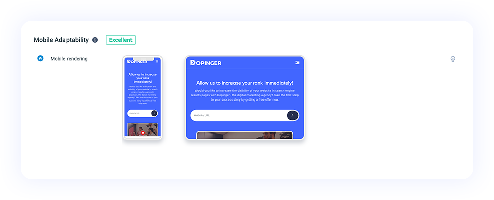
Mobile Rendering
Mobile rendering allows an internet browser to see an overview of how the page is rendered on different mobile devices. Here you can review the overview of the page on the smartphone and tablet screen.
The inspection tool receives real-time data. You then get an instant website view on the tablet and smartphone. In this way, you can have information about the page layout and structure.
In this section, you can only examine the general view. It does not give you a recommendation or evaluation result about what you should do.
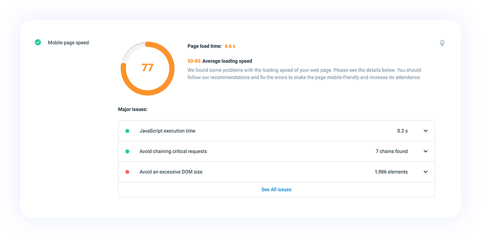
Mobile Page Speed
The loading time of your web page on the user's screen is mobile page speed. The tool calculates how long it takes for all items to appear to the user on a smartphone or tablet.
Page load time is calculated in seconds in this field. At the same time, mobile page speed is scored out of 100. 0-49 in red is classified as inadequate, 50-89 in orange should be improved, and 89-100 in green is classified as good.
Mobile page speed is one of the most determining factors in mobile compatibility. Under the mobile page speed section, various evaluations are made for the mobile page speed of your website. If you press the “Click to See All Problems” button, you can examine all the problems that slow down mobile page speed on your website and possible solutions.
If you click on the bottom arrow in each problem section, you can also find evaluation results and solution suggestions. If you want more detailed information, you can access the Google resource on the relevant subject by clicking on the blue icon at the end of the suggestion section.

AMP Check
AMP check shows you if your website has an accelerated mobile pages variation. Google developed AMP as an HTML framework to support mobile-first indexing.
Improved online user experience on mobile devices to speed up loading times with AMP. With AMP, unnecessary code and requests are reduced to a minimum. In this section, AMP-related control is made. If your website does not have an AMP version, you will receive an “AMP page not found” warning. If you have an AMP page, you will see special reviews for the page. This section is important for mobile compatibility.
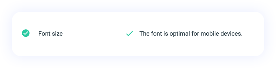
Font Size
Font size refers to the letter size of your text content on the web page. Since mobile devices have smaller screens, the font size in the desktop version may not work on mobile.
The size and size of content, headings and paragraphs is related to the font size. Font size should be readable on desktop devices. A user entering your website should be able to easily understand what the content is about.
It requires constant scrolling to read content with very large font size. It needs to be read by zooming in at a very small font size. For user experience, your content must be readable on mobile devices with different screen sizes and must be in sizes that do not require sufficient scrolling on the screen.
Font size is an important Google mobile-friendliness testing element. In this section, for the Dopinger SEO mobile friendly test evaluation, “The font is ideal for mobile devices.” You should receive the warning. Otherwise, you may also receive a warning that the font is too large or too small.
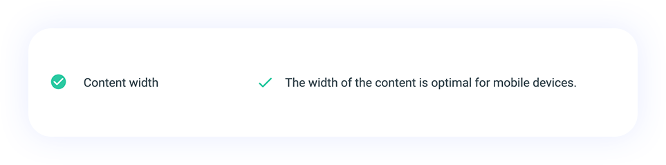
Content Width
Content width is a basic metric that reveals how wide the content on your web page is displayed. It may be necessary to specify a certain number of pixel values or refer to certain values in order to display the content.
Content width evaluation is important so that users can properly view content such as text, video and images on your website. Since the screen size may be different on mobile devices, the evaluation under this heading significantly affects the mobile user experience.
With content width, adjustments can be made for many elements such as different screen sizes, themes, special templates, and pages. If there are content width errors, there will be problems with horizontal scrolling. At the same time, there may be inaccuracies in layout elements and grid sections.
In this section, you should receive the warning "Content width is ideal for mobile devices". If you make a different evaluation, you can review the necessary suggestions for editing and make the necessary plans to correct the content width.
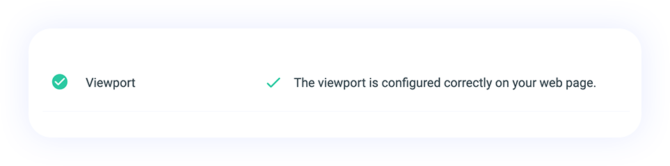
Viewport
The performance of websites is determined by their code structure. Viewport is an HTML meta tag structure that allows you to control the appearance of a web page on a mobile device. It provides information about the screen sizes that the website will fit in the web browser and the scaling status of the content on the page.
Viewport refers to the screen area that an internet user sees when he/she logs in to your website, without zooming or scrolling down. Viewport, one of the HTML tag structures, seriously helps your SEO. Therefore, take this evaluation section seriously to avoid a negative impact on SERP rankings. In this section “The view is configured correctly on your web page.” Just get the warning. Apart from this, if you receive a negative evaluation warning, you will also be given suggestions on how to resolve it.
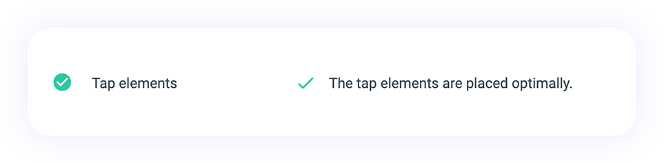
Tap Elements
Tap elements are elements on a web page that users can click. These sections can be CTA buttons or contain clickable links. By touching these elements, users can reach another page, open the site's menu, or access another website.
Evaluation of this metric is done in terms of sizing, accessibility and meeting users' needs. It is a very common problem that touchable elements do not overlap each other. In this case, users can touch a different object instead of the object they want to touch. If touch elements are poorly designed, the user experience will be negatively affected. With responsive design, you can be seen on all mobile devices.
Within the scope of SEO mobile friendly test tool, in the tap elements metric section, “Tappable elements are ideal for mobile devices.” You should receive a warning. In other warning cases, it means there is a problem. They provide you with an assessment of what the problem is with the touch elements and how to solve it. Visit our website and test website on mobile.
Other Free Dopinger SEO Tools
Dopinger offers free SEO tools to analyze your websites and create strategies to increase their performance. Here are the tools that we offer that can give a boost to your websites:

Website Analyzer Tool
The Website Analyzer tool lets you find out the missing or faulty parts of your website and also informs you about the technical SEO details.

SEO Competitor Analysis Tool
This tool helps you analyze the competitors in your sector that share the same targeted keywords.

Website Speed Test
With our site speed test tool, you can analyze the page opening speed of your site in detail, both on mobile and desktop.
Rank Tracker Tool
The Rank Tracker tool lets you see the keyword performance and the position changes of your website.
Rank Checker Tool
Rank Checker is a professional tool that allows you to determine the position of your website in search engines.

Structured Data Test
It allows you to check whether there is structured data marked on your site and the validity of this data.
Mobile Friendly Test F.A.Q.
Click the questions to see frequently asked questions and their answers.
Why is Mobile Compatibility Important for a Website?
What Does the Dopinger Mobile Compatibility Test Do?
Can I Trust Mobile-Friendly Test Results?
What Should I Do If My Website Is Not Mobile Compatible?
What Information Do I Need to Provide When Performing Mobile Usability Testing?
Will My Site Change During Mobile Compatibility Testing?
How Many Websites Can I Test?
How Long Does It Take to Check Mobile Compatibility?
What Should I Do to Fix Mobile Errors on My Website?
What If My Website Is Not Mobile Compatible?