Data visualization plays a vital role in understanding and communicating information effectively. Charts and graphs visually represent data trends, patterns, and insights. Google Sheets, a popular online spreadsheet tool, offers a powerful ” Explore ” feature that allows users to create automatic charts effortlessly. In this article, we will delve into the world of data visualization and learn how to create automatic charts with Google Sheets Explore to create compelling charts and graphs. Whether you are a data analyst, a student, or a business professional, mastering this feature will enable you to present your data with clarity and impact.
Understanding Google Sheets Explore
Google Sheets Explore is an intelligent feature integrated into Google Sheets that revolutionizes the way users analyze and visualize data. Powered by advanced machine learning algorithms, Explore offers users a simplified and efficient method to gain insights and create automatic charts and graphs. Learn how to create a graph in Google Sheets and take your visualization to the next step.
How to Access Google Sheets Explore
Accessing Google Sheets Explore is a straightforward process that allows users to unleash the power of data analysis and visualization within their spreadsheets. Follow these simple steps:
- Sign in to your Google account and navigate to Google Sheets.
- Choose an existing spreadsheet or create a new one by clicking the “+New” button and selecting “Google Sheets.”
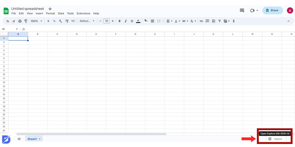
- Once you have your spreadsheet open, look for the “Explore” button in the bottom right corner of the screen. It appears as a small icon resembling a chart or graph.
- Click on the “Explore” button to activate the Explore sidebar. This sidebar provides a range of options for data analysis and visualization.
- With the Explore sidebar open, you can begin exploring your data. Enter specific queries, ask questions, or select data ranges to generate automatic charts, graphs, and insights based on the information in your spreadsheet.
Creating Basic Graphs and Charts in Google Sheets
Google Sheets Explore offers several chart types, including line charts, bar charts, and pie charts, to suit different data visualization needs. By selecting the relevant data range, Explore automatically suggests appropriate chart types. You may also be interested in how to create digital marketing reports using Google Data Studio.
Line Charts
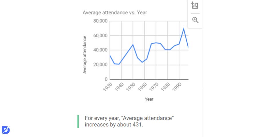
Line charts are an effective way to visualize trends and patterns over time or to compare multiple data series. Here’s how:
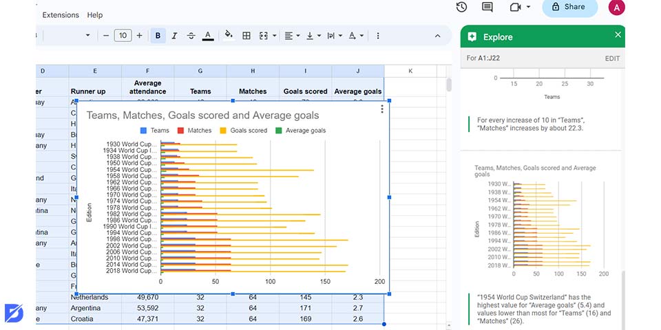
- Highlight the data range you want to include in the line chart. Make sure to include the headers and all the relevant data points.
- Click the “Explore” button in the bottom right corner of the Google Sheets interface to open the Explore sidebar.
- In the Explore sidebar, Google Sheets automatically analyzes your selected data and suggests appropriate chart types. Look for the “Line chart” option and click on it to generate the line chart.
- Once the line chart is created, you can customize it further. Use the Chart Editor panel to modify chart elements such as titles, axes, colors, and styles. You can also add data labels and legends for better clarity.
Bar Charts
Bar charts are ideal for comparing different categories or displaying discrete data. With Google Sheets Explore, creating bar charts is a breeze. Here’s how:
- Highlight the data range that includes the categories and their respective values for the bar chart. Include the headers and all relevant data points.
- Click the “Explore” button in the bottom right corner of the Google Sheets interface to open the Explore sidebar.
- In the Explore sidebar, Google Sheets analyzes your selected data and presents suitable chart options. Look for the “Bar chart” option and click on it to generate the bar chart.
- Once the bar chart is created, you can customize it to suit your preferences. Use the Chart Editor panel to modify the chart’s appearance, such as adjusting colors and fonts and adding axis labels and titles.
Pie Charts
Pie Charts are effective for illustrating proportions or percentages. With Google Sheets Explore, you can easily create pie charts to represent your data visually. Here’s how:
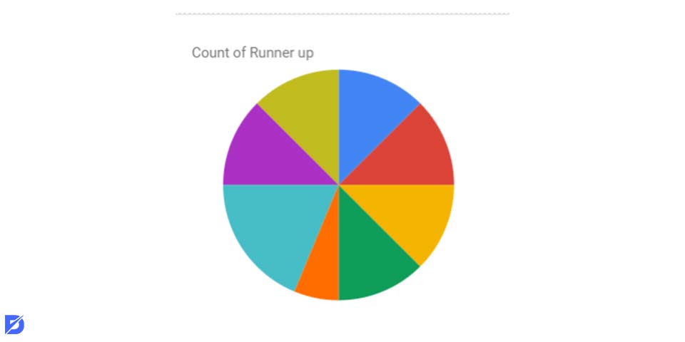
- Highlight the data range that includes the categories and their corresponding values for the pie chart. Ensure that the headers and data points are included.
- Click the “Explore” button in the bottom right corner to open the Explore sidebar.
- In the Explore sidebar, Google Sheets analyzes your selected data and suggests suitable chart options. Look for the “Pie chart” option and click on it to generate the pie chart.
- Once the pie chart is created, you can customize it to enhance its visual impact. Utilize the Chart Editor panel to adjust colors, explode specific slices, add labels, and fine-tune the chart’s appearance.
Customizing and Formatting Charts
Google Sheets Explore provides various customization options to enhance your charts’ visual appeal and effectiveness.
Chart Styles and Themes
Google Sheets Explore offers a range of customization options to enhance your charts’ visual appeal and consistency. Let’s explore how you can customize chart styles and themes:
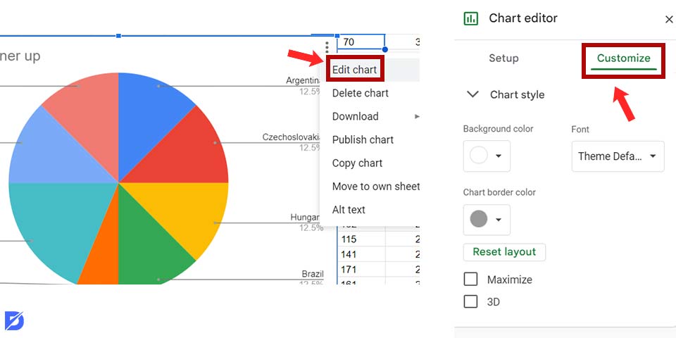
- Once you’ve created a chart using Google Sheets Explore, click on the chart to activate the Chart Editor panel. You can also access it by right-clicking on the chart and selecting “Chart Editor.”
- In the Chart Editor panel, navigate to the “Customize” tab. Here, you will find various options to modify the chart’s appearance. Under the “Chart style” section, you can choose from different predefined styles or themes.
- Explore the “Chart & axis titles” and “Chart & axis colors” to further customize the chart. Adjust the colors, fonts, and background settings to match your preferences or align with your brand guidelines.
Axis Labels and Titles
Google Sheets Explore allows you to add informative axis labels and titles to provide additional context and clarity to your charts. Follow these to customize axis labels and titles:
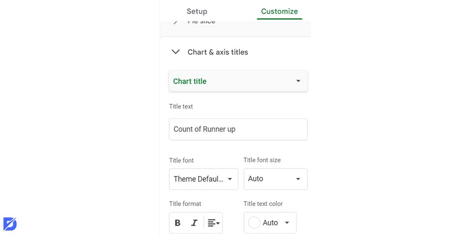
- Go to the “Customize” tab in the Chart Editor panel and select the “Axis” section. Here, you can modify the labels for the horizontal (X) and vertical (Y) axes. You can change the text, format the numbers, or use custom labels to provide more descriptive information.
- To add titles to the axes, navigate to the “Chart & axis titles” section in the Chart Editor panel. Enable the “Axis titles” option and enter the desired titles.
- You can further refine the appearance of the axis titles by modifying their alignment, font size, color, and style. Use the options available in the Chart Editor panel to make the titles visually consistent with the overall chart design.
Data Labels and Legends
Google Sheets Explore allows you to add data labels and legends to your charts, making it easier for viewers to interpret the information presented. Here’s how:
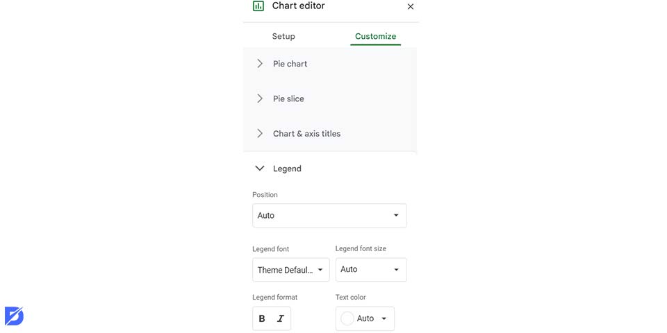
- Go to the “Customize” tab in the Chart Editor panel and select the “Data labels” section. Enable the “Data labels” option to display labels on the chart elements, such as bars, lines, or slices. Depending on your preference, you can choose to display the actual data values or percentages.
- Adjust the format and positioning of the data labels using the available customization options. You can change the font style, color, and size, as well as control their placement within the chart elements to ensure readability.
- To customize the chart’s legend, navigate to the “Customize” tab and select the “Legend” section in the Chart Editor panel. You can enable or disable the legend, position it within the chart, and customize its appearance, including font style, color, and alignment.
Advanced Charting Techniques
Google Sheets Explore also offers advanced charting techniques to refine your data visualizations.
Combination Charts
Google Sheets Explore offers the capability to create combination charts, which allow you to overlay multiple chart types on the same graph. This advanced technique enables more comprehensive analysis and comparison of data. Here’s how:
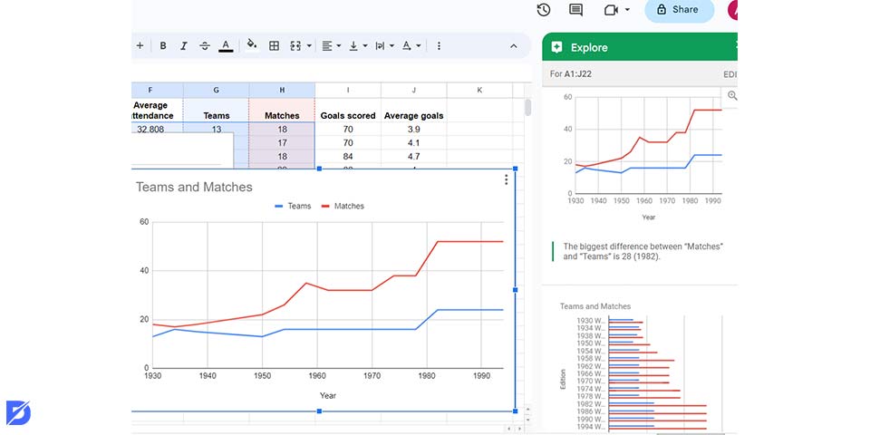
- Choose the data, ensuring it contains the necessary columns for different chart types.
- Click the “Explore” button in the bottom right corner of the Google Sheets interface to open the Explore sidebar.
- In the Explore sidebar, Google Sheets will analyze your selected data and suggests appropriate chart types based on the available columns. Look for the “Combo chart” option and click on it to generate the combination chart.
- Once the combination chart is created, you can customize it to meet your requirements. Use the Chart Editor panel to modify the chart types for each data series.
Trendlines and Error Bars
Google Sheets Explore also allows you to incorporate trendlines and error bars into your charts, providing additional insights into data trends and variability. Here’s how you can add trendlines and error bars:
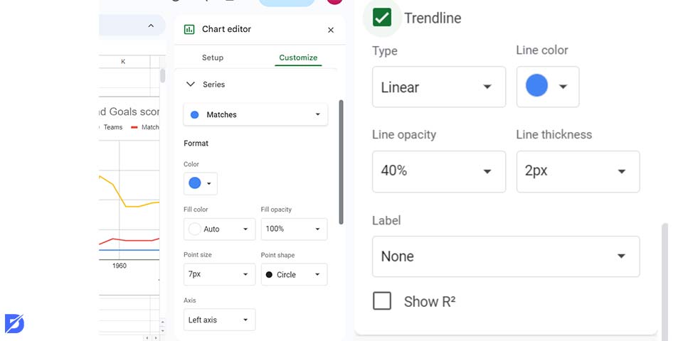
- Choose the data range you want to include in your chart, ensuring it contains the necessary columns for trendlines or error bars.
- Use Google Sheets Explore to create the desired chart type based on your data, such as a line chart or a scatter plot.
- In the Chart Editor panel, navigate to the “Series” section. Select the data series for which you want to add a trendline and enable the “Trendline” option. Google Sheets will automatically calculate and display the trendline that best fits the data points.
- To add error bars to your chart, go to the “Series” section in the Chart Editor panel. Select the data series to which you want to add error bars and enable the “Error bars” option. You can customize the error bar type, range, and display format to suit your needs.
Interactive Charts
Google Sheets Explore allows you to create interactive charts that allow users to dynamically explore and interact with the data. Here’s how you can make your charts interactive:
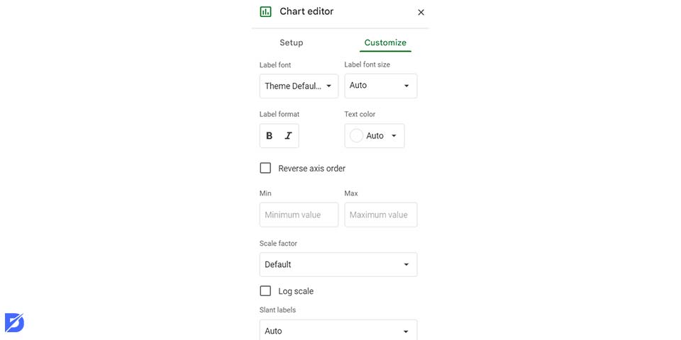
- Choose the data range you want to include in your chart, ensuring it contains the relevant columns and data points.
- Use Google Sheets Explore to create the desired chart type based on your data.
- In the Chart Editor panel, navigate to the “Customize” tab and explore the interactive options available. Enable features such as data filters, drop-down menus, or sliders to allow users to interactively control and filter the data displayed in the chart.
- Preview the chart to ensure the interactivity functions as intended. Once satisfied, you can share the chart with others.
Collaborating and Sharing Charts
Collaboration is an essential aspect of working with charts in Google Sheets Explore. Here, we will explore how you can collaborate effectively and share your charts with others:
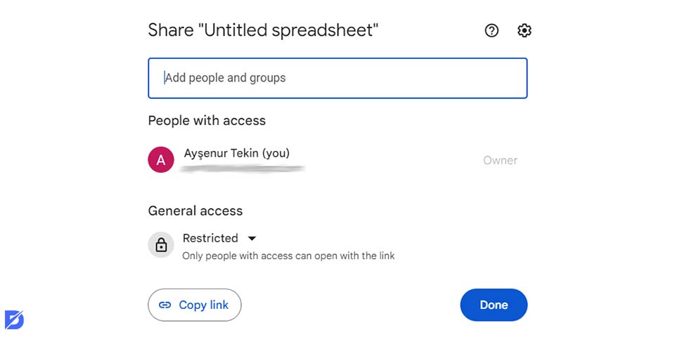
- Click on the “Share” button in the top right corner of the Google Sheets interface. Enter the e-mail addresses of the individuals and choose whether they will have a view or edit access to the spreadsheet containing the charts.
- Google Sheets Explore enables real-time collaboration, allowing multiple users to work on the charts simultaneously. You and your collaborators can make real-time changes, add data, or modify the chart setting.
- Use the commenting feature in Google Sheets to provide feedback, discuss chart details, or ask questions. Select a specific chart element, right-click, and choose “Comment” to leave comments directly on the chart.
- Share the spreadsheet link via e-mail, messaging apps, or by generating a shareable link. Collaborators can then access and explore the charts directly from the shared link.
- You can publish your charts or embed them in other platforms. In the Chart Editor panel, navigate to the “Publish chart” option. Choose the publishing format, such as an image or an interactive chart, and copy the generated link or embed code.
Troubleshooting and Tips
Even with the user-friendly nature of Google Sheets Explore, you may encounter certain challenges or have questions while working with charts. Let’s check them:
Data Range
Ensure the data range is properly selected and includes all the necessary columns and rows. Incorrect data selection can lead to inaccurate or incomplete charts.
Chart Refresh
If your chart does not update with new data, try refreshing it. Click on the chart and go to the Chart Editor panel. Click the “Refresh” button to update the chart with the latest data.
Data Formatting
Check that your data is formatted correctly. Numeric data should be in numerical format, dates should be in date format, and text should not contain any extra characters or symbols that can interfere with calculations or chart generation.
Internet Connection
A stable internet connection is crucial for seamless chart creation and exploration. If you encounter issues, ensure your internet connection is stable and try reloading the page or restarting the browser.
Chart Editor Customization
Explore the various customization options in the Chart Editor panel to refine the appearance and functionality of your charts. Experiment with different settings to achieve the desired visual and analytical outcomes. You can also check Google Ads Editor: what it is & how to use it here.
Explore Documentation and Community
If you have questions or need further assistance, consult the official Google Sheets Explore documentation and community forums. These resources provide detailed information, tutorials, and troubleshooting guidance.
Keyboard Shortcuts
Familiarize yourself with keyboard shortcuts in Google Sheets to navigate and perform actions quickly. This can enhance your efficiency while working with charts and the Explore feature.
You can also check Google SEO tools here. SEO and SEO tools are important for your Google game, so don’t forget to check them out!
Conclusion
In this article, we explored the fundamentals of creating automatic charts, learned how to make a graph in Google Sheets, how to create a bar graph in Google Sheets, or charts in Google Sheets, as well as advanced techniques for customization and collaboration. Now, you know how to create automatic charts with Google Sheets Explore, so let’s unleash your creativity, experiment with different chart types, and unlock the full potential of data visualization with Google Sheets Explore.
Frequently Asked Questions About
No, there isn’t. You have a limitless number of charts.
Yes, you can export your charts as image files or PDFs.
Yes, you can. As you add or modify data, the associated chart will automatically update to reflect the changes.
Yes, it is. Simply copy and paste data or use the “Import” function to connect to external data sources such as CSV files or databases.
Yes, you can. Apply filters to your data range in Google Sheets, and the Explore feature will generate charts based on the filtered data.


No comments to show.